03 Audi A5 FAMILY CONCEPT
A DESIGN SOLUTION FOR EXPLORING THE A5 FLEET
OBjective
Leverage page intelligence and search experience data to make informed decisions for the launch of the Audi A5 Family landing page
The Family page will serve as a gateway to the A5 MLPs and we want to strategically align this content with user expectations, the customer journey and business KPIs. We will identify the best way to structure a responsive experience that introduces the Audi A5 Family of models simplistically, and holistically by incorporating the elements that users find most valuable in completing their desired action.


RESEARCH
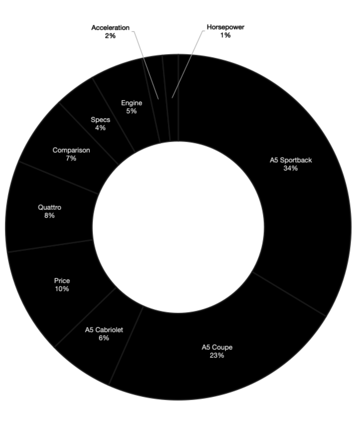
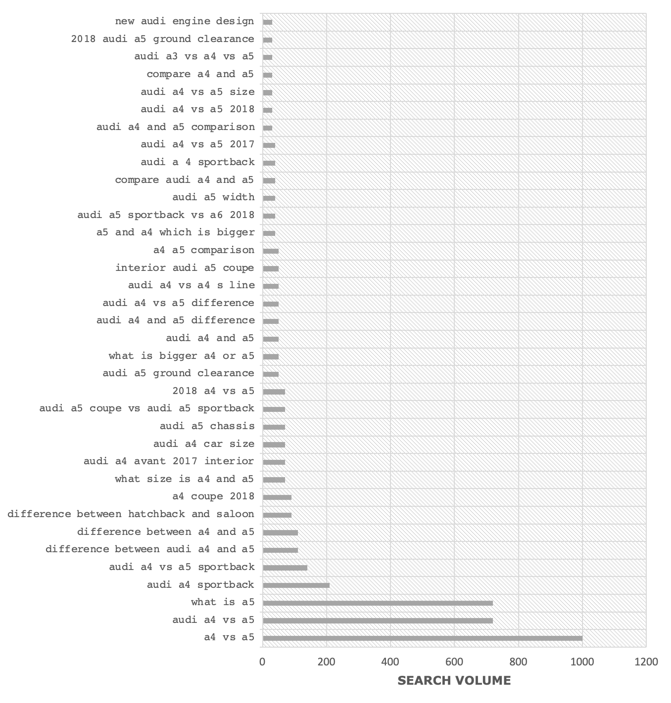
I analyzed search data to determine content that users are most interested in seeing. From the data, the three main insights I uncovered were:
• The Sportback has the highest search volume among the A5 models.
• In the research phase, users primarily compare the A5 Sportback to the S5 Sportback and the A5 Sportback to the A5 Coupe.
• Price is the initial most important piece of information that users look for when considering the A5.


I also analyzed Mobile and Desktop heat maps to gain a better understanding of how users engage with the content and navigate throughout the page. The key insights I uncovered were:
MOBILE - 22.3K VISITS, 29.5K CLICKS
• ‘Build’ CTA out performs the ‘Request a Quote’ CTA in every instance. Example, in the hero,‘Build’ receives 10.6% of all clicks while ‘Request a Quote’ receives 0.5%. (For Desktop, 10.2% and 0.2%, respectively)
• 75% of interest drops around the ‘Specs. Overview’ section. (Same for Desktop)
• 80.4% of visitors are ‘New’ to the page while the remaining 19.6% are ‘Returning’.
DESKTOP - 16.4K VISITS, 40.3K CLICKS
• The ‘Make It Your Own’ section shows the highest engagement in a single area. Combined, the elements in the section receive approx. 24.4% of all clicks.
• Of all the sections in the secondary nav, Trims & Specs receive the most engagement.
CONTENT STRATEGY
Leveraging the insights I uncovered from the research, I concluded the following strategic recommendations for creative and content direction:
• Include clickable components outside of CTAs that allow the user to engage. This will encourage exploration and longer sessions.
• Minimize user drop off by shortening the scroll.
• Help the user get to information they care about sooner by positioning the most desired models and content early on.
• Implement a view that allows the user to easily compare differences between Audi models and ultimately pursue the right model for them.
wireframes
The design solution based on our research and strategy:
• Clear overall differentiation between all A5 and S5 models
• Order the presentation of vehicles to meet the consumer demand and search intent (Sportback first, followed by Coupe and lastly Cabriolet)
• Vertical top-bottom view of comparable models
• Quick view of meaningful content based on search intent
• Medium scroll length
• Several paths to model landing pages


Next Steps
Journey Mapping
To validate the significant touch points in our user’s journey
Usability and A/B Testing
To iterate and improve upon the experience
Information Architecture
To streamline and optimize the user flow to all Audi model landing pages

